Call Ken Handyman Services
Logo Design
Ken approached me seeking a logo and general visual branding for his handyman business. As a fan of baseball and classic American branding, Ken was drawn to old-school, retro-style logos and graphics. Our goal was to create a design that reflected his personality while evoking a nostalgic, all-American feel.
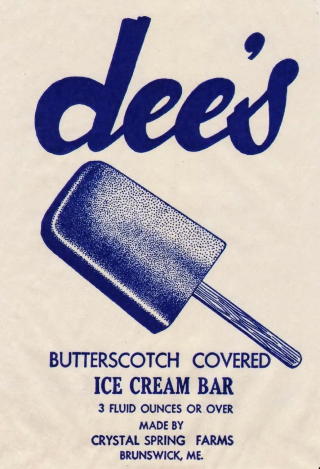
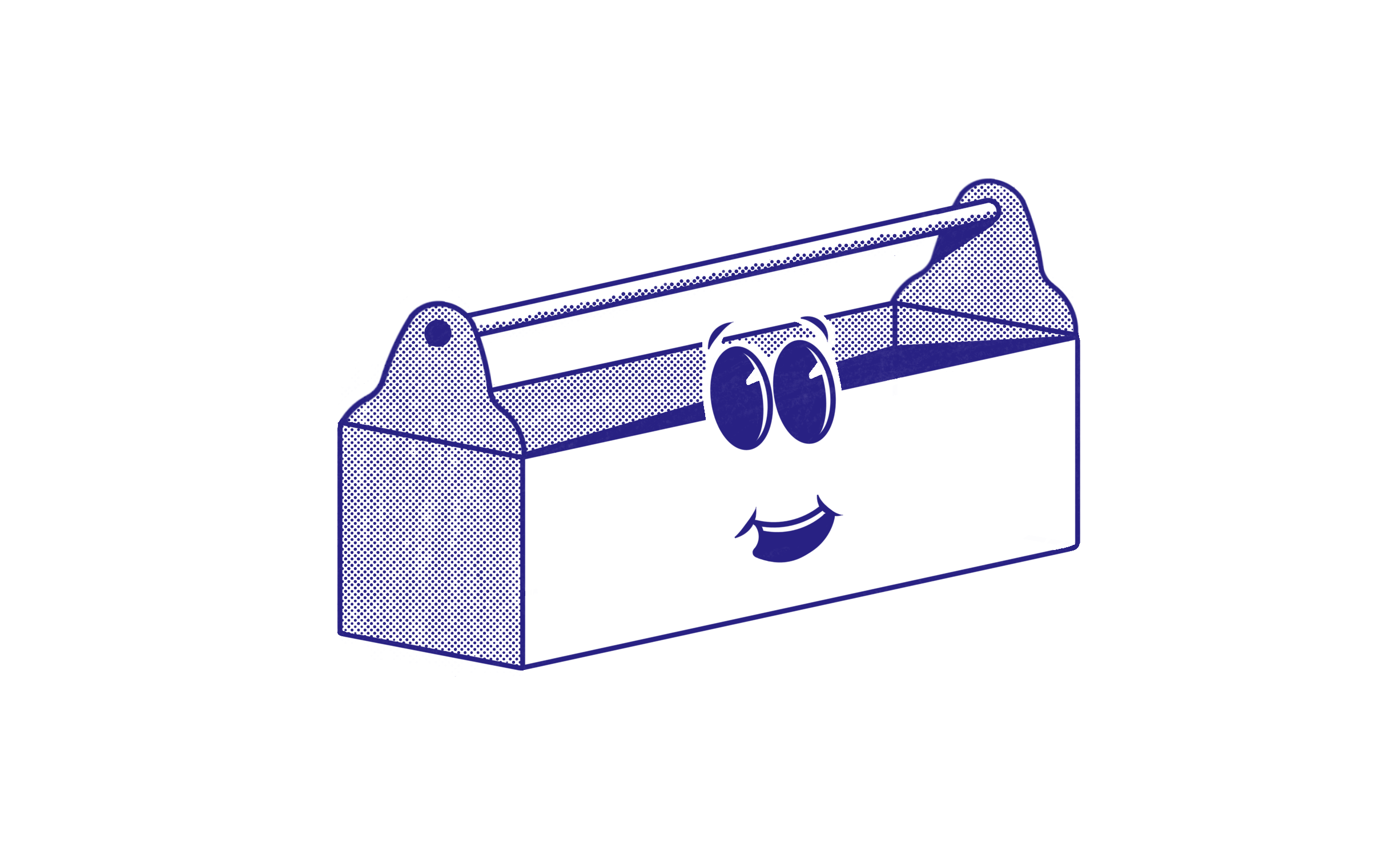
We explored vintage American design, particularly inspired by 1920s and 1930s rubber hose animation — a style that marked a new era in American graphics. The idea of using a rubber hose-style character as a mascot aligned perfectly with Ken’s vision. After considering the tools Ken uses in his work, we found that a hammer naturally resembled human features, making it an ideal character base.
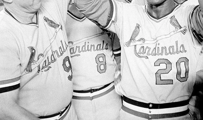
I drafted a hammer mascot with rubber hose-style eyes and arms, adding a comic book-style screentone texture for depth. For the typography, I chose a combination of Oilvare and Fineday fonts — balancing a strong, blocky feel with a classic script. The slight slant of the font and the extended “s” on the sticker logo were inspired by vintage baseball jerseys. I also incorporated patchwork-style callouts in the main logo, reminiscent of retro newspaper ads for local businesses.
We created the slogan “Just Call Ken!” to emphasize Ken’s approachable, can-do attitude — a direct answer to the common household dilemma: “What should I do?”
The final logo captures Ken’s retro, all-American style while reflecting his personality and expertise as a handyman. The character-driven design and thoughtful font choices created a cohesive and nostalgic brand identity that feels both professional and inviting.
